PROJECT
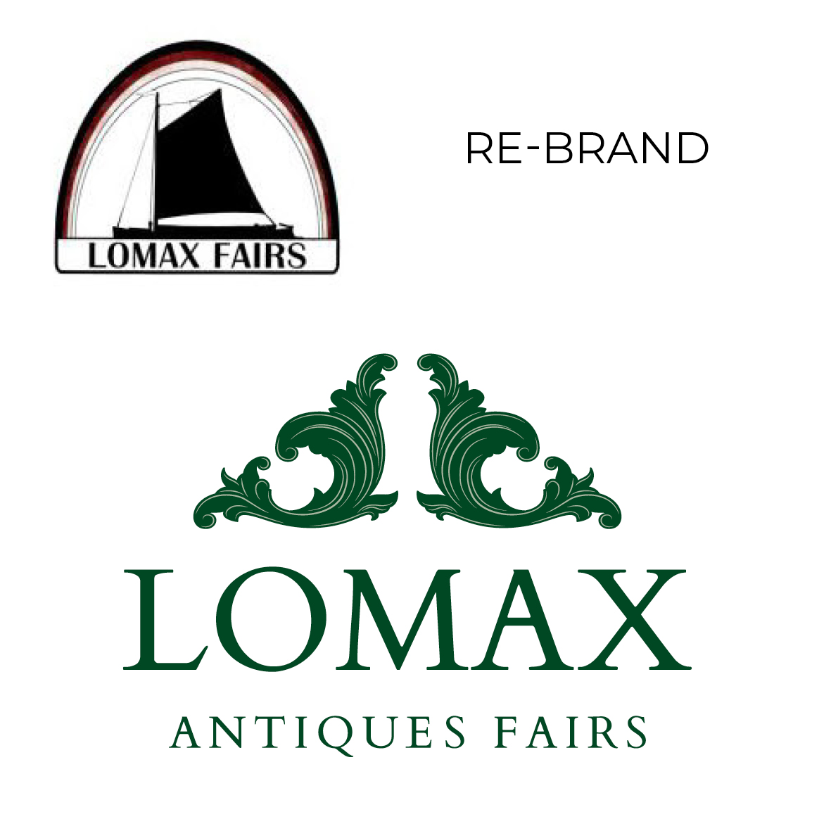
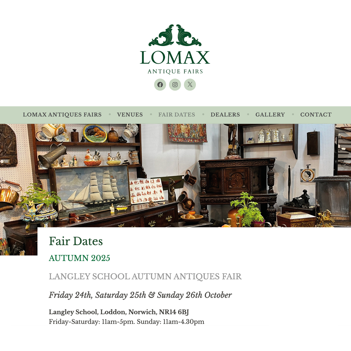
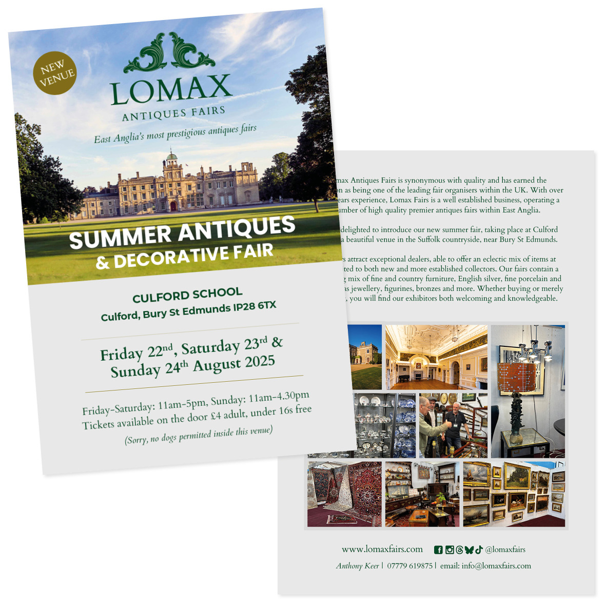
Rebrand and new logo to be used on printed and digital materials.
CLIENT: Lomax Antiques Fairs
A 20-year-established antique trade business with new owners seeking a brand refresh.
As the business was well known with a strong reputation after 20 years of trading, it was important that the rebrand acknowledged the past success but could take the business forward. With the antique business covering art, furniture, silver, art, rugs and porcelain, I wanted a logo that would relate to the entirety of their market. I chose an antique emblem that is frequently found in different guises and used British Racing Green to give a classic and prestigious image.
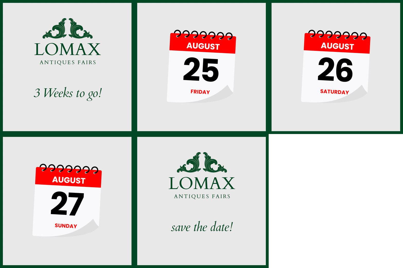
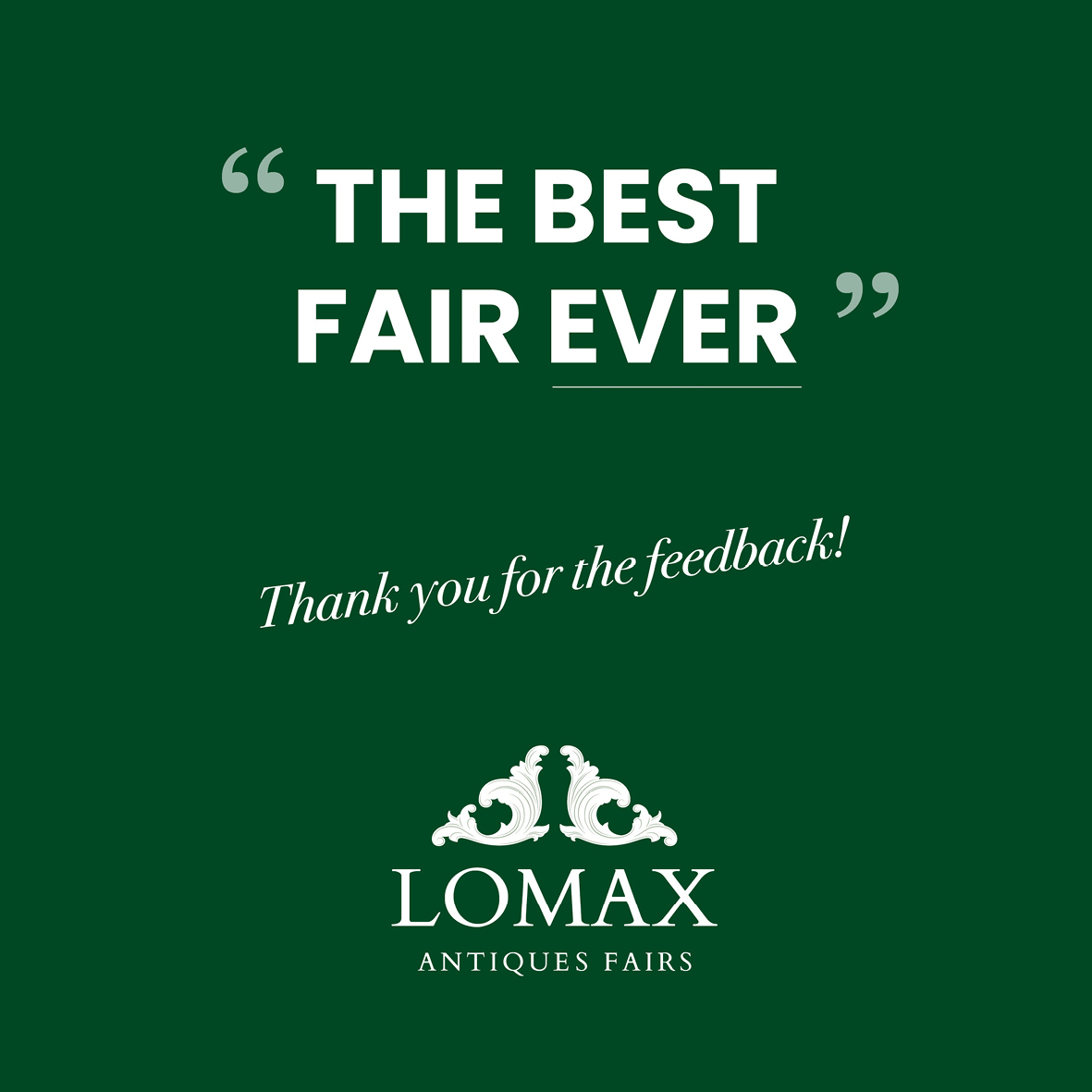
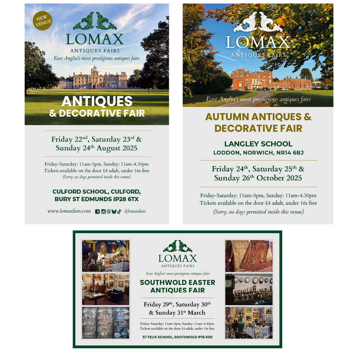
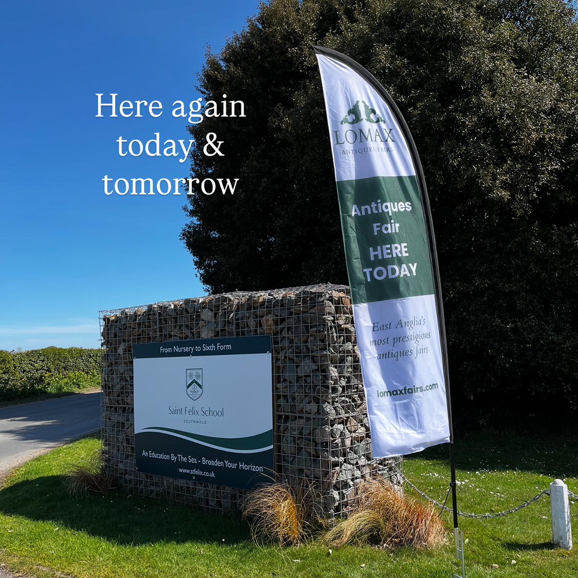
For each event, I manage adverts in local and national press, social media, road signage, flyers, tickets and internal signage at the events.
VISIT WEBSITE